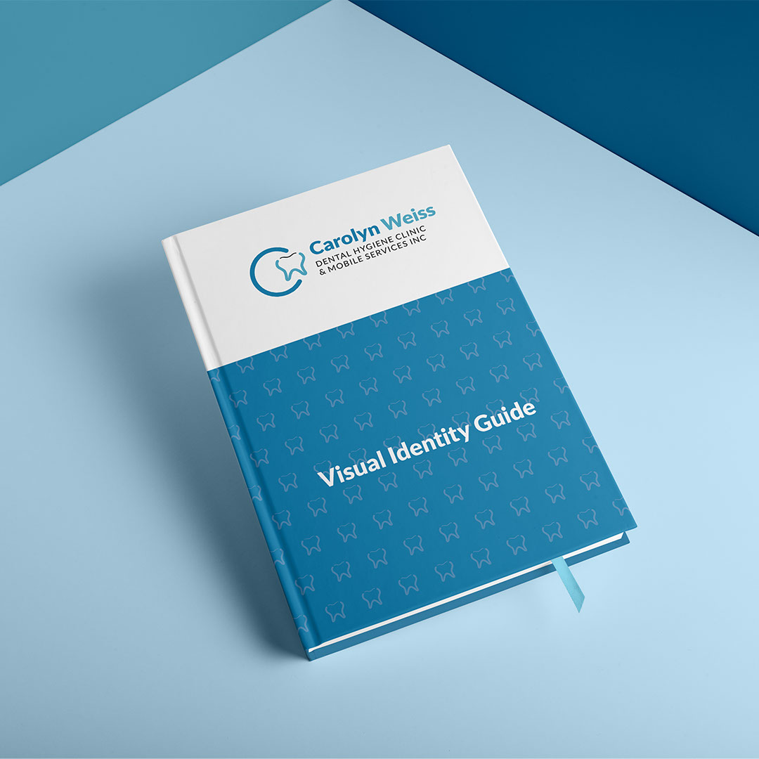
In making the logo, my goal was to create a simple, memorable mark that encapsulated Carolyn's initials, a tooth, and a representation of her services being part of a circle of care for seniors. Soft blue colours were also chosen to reflect the cleanliness & professionalism of her services while also being approachable & friendly.
The brochure was created to grab attention, illustrate the importance of good dental hygiene, showcase Carolyn's services, and introduce her to the reader. The business cards were made to be dual purpose as appointment cards.
The brochure shown is a proposed concept that was later modified. The business card and identity system were fully approved.
print pros plus
Graphic Designer,
Digital Print Specialist,
Large Format Assistant,
Marketing Assistant
Jul 2015— Present